
2026.05.07
Plain Text 3
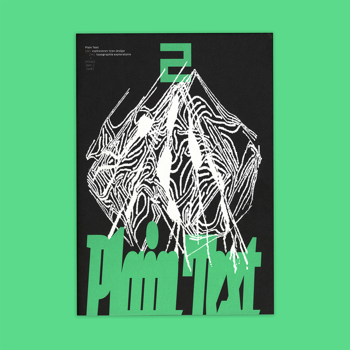
Plain Text is a printed publication for exploratory type design, edited and designed by Lucas Descroix and Benjamin Dumond, and published by type foundry Plain Form.
From fiction to theory, from mystical analyses to visual works, Plain Text aims at exploring typographic imaginaries, moving beyond a strictly historical and technical framework, with a taste for the unknown and the dormant potential of writing.
The third issue launched in March 2026 and includes contributions by Alex Balgiu, Eugénie Bidaut, Mathis Borel, Gabriele Čepulytė, Lucas Descroix, Johanna Drucker, Benjamin Dumond, Mankun Guo, Hélène Marian, Luther R Marsh, Ariel Martín Pérez, Laurent Mbaah, and Mălin Neamțu.
The texts of this black-and-white, bilingual publication are all set in the unreleased duo Basically Serif for the English and Basically Sans for the French. Additional information is set in Baskemo, also Serif and Sans, an automatically monospaced-and-skelefont’ed companion to Basically.
A number of display typefaces designed by Lucas Descroix and/or Benjamin Dumond are used throughout, for the title of each contribution as well as various emphasis moments. These include: Michaux, Nostra, Paraiso Sans, Jester (in several styles), Ready Active, and an early version of the upcoming Ferro. Some unreleased display typefaces, either old or future, are also used but not shown here in the pictures.
Several typefaces are also showcased as part of contributions by their respective designers (shown here are Bye Bye Binary’s BBB ReadMe and Mălin Neamțu’s Segmentor).
• English and French • 80 pages, 210×297mm • offset print on Munken Print White • 750 copies, March 2026 • ISBN 978-2-9597254-3-2
This third issue of Plain Text was kindly supported by Abyme, Blaze Type, Dinamo, DJR, Klim Type Foundry, Rosetta, The Designers Foundry, and XYZ Type.

Each issue starts with a few spreads showing a condensed, somewhat chaotic trip through the whole content of the publication (each contribution is represented by its title and an image, in order of appearance). It’s like wetting your neck before diving.

The title set in squeezed Michaux Bold.

The left page shows BBB ReadMe (Eugénie Bidaut, Ludi Loiseau & Clara Sambot) with its inclusive ligatures. The right page shows Eugénie Bidaut working on preparatory drawings.

This spread showcases the typeface Segmentor (Mălin Neamțu), together with hand-drawn sketches by the designer.

The title set in Paraiso Sans and Michaux Regular. Illustration by Anne Zeum.

The title set in heavily squeezed Ferro Mono. The image is taken from Émile Javal’s research.

Both titles are set in Jester, stretched and blurred on the left page, squeezed and outlined on the right page.

The title set in Ferro Black, with additional ‘organic’ letters based on Michaux.

The title on the right page is set both in Paraiso Sans (black) and Ready Active (white).

The left page shows the work of Mankun Guo. The title on the right page is set in Nostra Stream (with a bunch of blur and grain effects), with a little Grandmaster cameo for “and”. Subheads use Michaux Light.

The title set in various versions of Ferro Mono. The book cover is the one for Missing sign, another printed publication from Plain Form.
Originally published on Fonts In Use. All imagery and text remain the property of their respective owners.