
2026.01.27
Plain Text 2
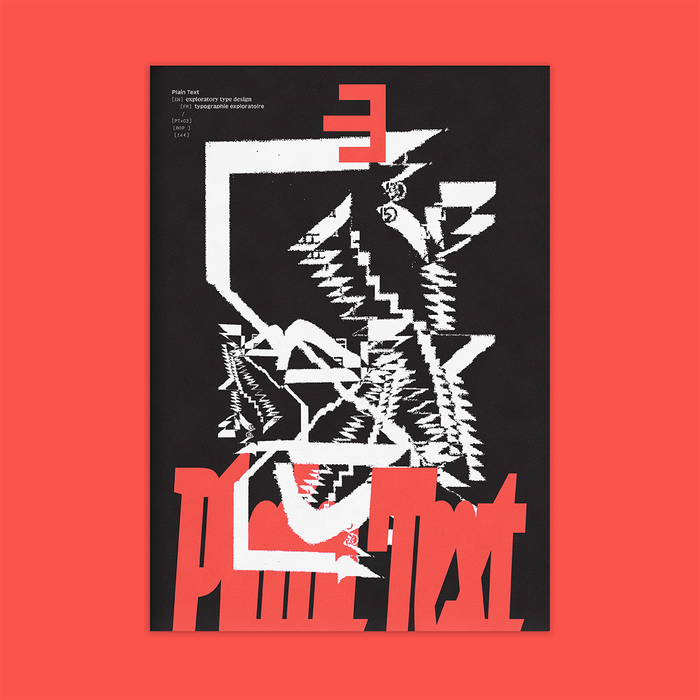
Plain Text is a printed publication for exploratory type design, edited and designed by Lucas Descroix and Benjamin Dumond, and published by type foundry Plain Form. The second issue launched in July 2025.
From fiction to theory, from mystical analyses to visual works, Plain Text aims at exploring typographic imaginaries, moving beyond a strictly historical and technical framework, with a taste for the unknown and the dormant potential of writing.
This second issue includes contributions by Hervé Aracil, Tim Brookes (Endangered Alphabets), Aliona Ciobanu, Lucas Descroix, Benjamin Dumond, Mardi Forestier, Inscript festival, Elenor Kopka, Marcus Leis Allion, Pierre Pané-Farré (with HAW Hamburg students), Simon Renaud and Alec Vivier-Reynaud.
The texts of this black-and-white, bilingual publication are all set in the unreleased duo Basically Serif for the English and Basically Sans for the French. Additional information is set in Baskemo, also Serif and Sans, an automatically monospaced-and-skelefont’ed companion to Basically.
A number of display typefaces designed by Lucas Descroix and/or Benjamin Dumond are used throughout, for the title of each contribution as well as various emphasis moments. These include: Michaux, Grandmaster, Disc, Jester (in several styles), Ready Active and Clouded and an early version of the upcoming Ferro. Some unreleased display typefaces, either old or future, are also used but not shown here in the pictures.
The fiction work by Mardi Forestier is set in Exposure by Federico Parra Barrios. Imagined together with the author, the layout is an attempt at using an experimental typeface to underline and augment narration, its variations manifesting the idea of breath.
• English and French • 80 pages, 210×297mm • offset print on Munken Print White • 1000 copies, July 2025 • ISBN 978-2-9597254-1-8
This second issue of Plain Text was kindly supported by Commercial Type, CSTM Fonts, Dinamo, Future Fonts, XYZ Type, and 205TF.

Title is set in Disc Heavy, while subheads use Michaux Light.

Left page shows works from Aliona Ciobanu (image in the center is a collaboration with designer Stefaniia Bodnia). Right page shows the work of Alec Vivier-Reynaud (featuring mushroom-printed ABC Camera).

Title is set in a early version of Ferro Fraktur IV. Images show works from Bettina Comte, Rüdiger Schlömer and Jonathan Mak.

Title set in Jester Fool (squeezed, tracked and slightly blurred).

Title set in Ready Active Regular (condensed and thinned).

Title set in Grandmaster Thin. The right page shows both designs and inspirations from Simon Renaud.

Left page shows designs and inspirations from Simon Renaud. Right page’s title is set in generously stretched Exposure.

A piece of fiction by Mardi Forestier, making use of Federico Parra Barrios’s typeface Exposure to manifest breath.

Title on the right page is set in heavily warped Jester Judgment (in black) and Jester Sun (in white).

Left page features Ohno’s Swear. Right page features Bureau Brut’s Totentanz.

Title set in Michaux Bold, for a conversation with French professor Hervé Aracil.

Left page shows student projects from HAW Hamburg, done under the direction of Pierre Pané-Farré (here the collective typeface Octagon Variable and A Type of Image by Fabian Stenzel). Right page’s title is set in Ready Clouded Bold.
Originally published on Fonts In Use. All imagery and text remain the property of their respective owners.