
Gallery
AaBbCcDdEeFfGgHhIiJjKkLlMm
Display Thin
AaBbCcDdEeFfGgHhIiJjKkLlMm
Display Thin Italic
AaBbCcDdEeFfGgHhIiJjKkLlMm
Headline Thin
AaBbCcDdEeFfGgHhIiJjKkLlMm
Headline Thin Italic
AaBbCcDdEeFfGgHhIiJjKkLlMm
Text Thin
AaBbCcDdEeFfGgHhIiJjKkLlMm
Text Thin Italic
AaBbCcDdEeFfGgHhIiJjKkLlMm
Display Light
AaBbCcDdEeFfGgHhIiJjKkLlMm
Display Light Italic
AaBbCcDdEeFfGgHhIiJjKkLlMm
Headline Light
AaBbCcDdEeFfGgHhIiJjKkLlMm
Headline Light Italic
AaBbCcDdEeFfGgHhIiJjKkLlMm
Text Light
AaBbCcDdEeFfGgHhIiJjKkLlMm
Text Light Italic
AaBbCcDdEeFfGgHhIiJjKkLlMm
Display Regular
AaBbCcDdEeFfGgHhIiJjKkLlMm
Display Italic
AaBbCcDdEeFfGgHhIiJjKkLlMm
Headline Regular
AaBbCcDdEeFfGgHhIiJjKkLlMm
Headline Italic
AaBbCcDdEeFfGgHhIiJjKkLlMm
Text Regular
AaBbCcDdEeFfGgHhIiJjKkLlMm
Text Italic
AaBbCcDdEeFfGgHhIiJjKkLlMm
Display Medium
AaBbCcDdEeFfGgHhIiJjKkLlMm
Display Medium Italic
AaBbCcDdEeFfGgHhIiJjKkLlMm
Headline Medium
AaBbCcDdEeFfGgHhIiJjKkLlMm
Headline Medium Italic
AaBbCcDdEeFfGgHhIiJjKkLlMm
Text Medium
AaBbCcDdEeFfGgHhIiJjKkLlMm
Text Medium Italic
AaBbCcDdEeFfGgHhIiJjKkLlMm
Display SemiBold
AaBbCcDdEeFfGgHhIiJjKkLlMm
Display SemiBold Italic
AaBbCcDdEeFfGgHhIiJjKkLlMm
Headline SemiBold
AaBbCcDdEeFfGgHhIiJjKkLlMm
Headline SemiBold Italic
AaBbCcDdEeFfGgHhIiJjKkLlMm
Text SemiBold
AaBbCcDdEeFfGgHhIiJjKkLlMm
Text SemiBold Italic
AaBbCcDdEeFfGgHhIiJjKkLlMm
Display Bold
AaBbCcDdEeFfGgHhIiJjKkLlMm
Display Bold Italic
AaBbCcDdEeFfGgHhIiJjKkLlMm
Headline Bold
AaBbCcDdEeFfGgHhIiJjKkLlMm
Headline Bold Italic
AaBbCcDdEeFfGgHhIiJjKkLlMm
Text Bold
AaBbCcDdEeFfGgHhIiJjKkLlMm
Text Bold Italic
AaBbCcDdEeFfGgHhIiJjKkLlMm
Display ExtraBold
AaBbCcDdEeFfGgHhIiJjKkLlMm
Display ExtraBold Italic
AaBbCcDdEeFfGgHhIiJjKkLlMm
Headline ExtraBold
AaBbCcDdEeFfGgHhIiJjKkLlMm
Headline ExtraBold Italic
AaBbCcDdEeFfGgHhIiJjKkLlMm
Text ExtraBold
AaBbCcDdEeFfGgHhIiJjKkLlMm
Text ExtraBold Italic
AaBbCcDdEeFfGgHhIiJjKkLlMm
Display Black
AaBbCcDdEeFfGgHhIiJjKkLlMm
Display Black Italic
AaBbCcDdEeFfGgHhIiJjKkLlMm
Headline Black
AaBbCcDdEeFfGgHhIiJjKkLlMm
Headline Black Italic
AaBbCcDdEeFfGgHhIiJjKkLlMm
Text Black
AaBbCcDdEeFfGgHhIiJjKkLlMm
Text Black Italic
0
48 styles + Variable
Jan Estrada-Osmycki
In Use
Buy Wulkan Typeface
- Automatic discount when adding additional styles or users.
- One time payment, no annual fees or subscription.
- Logo & social media use included with Desktop License.
Loading licenses...
❷ Styles
Total
USD$0.00
Checkout
In Use
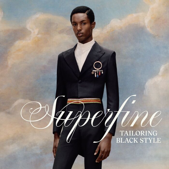

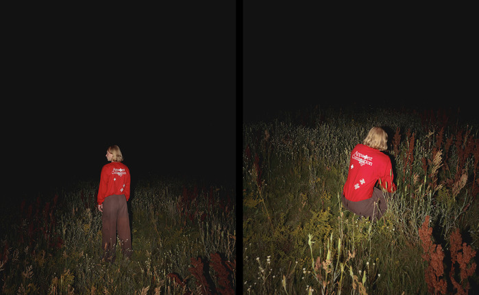
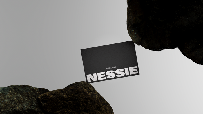
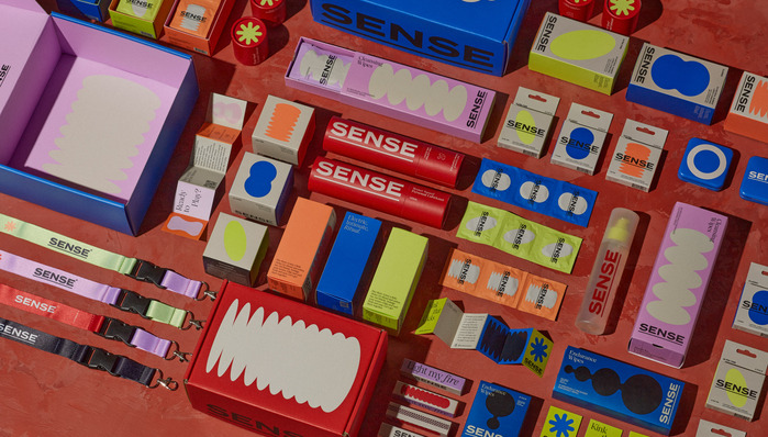
Pair With: Halisa